Docs

CheckoutWithEth

CheckoutWithEth embeds a component on your page that accepts ETH payments on Ethereum.

This component also handles:

  • Connecting the payment wallet
  • Prompting the payment wallet to switch chain, if necessary
  • Informing the payment wallet they have insufficient funds
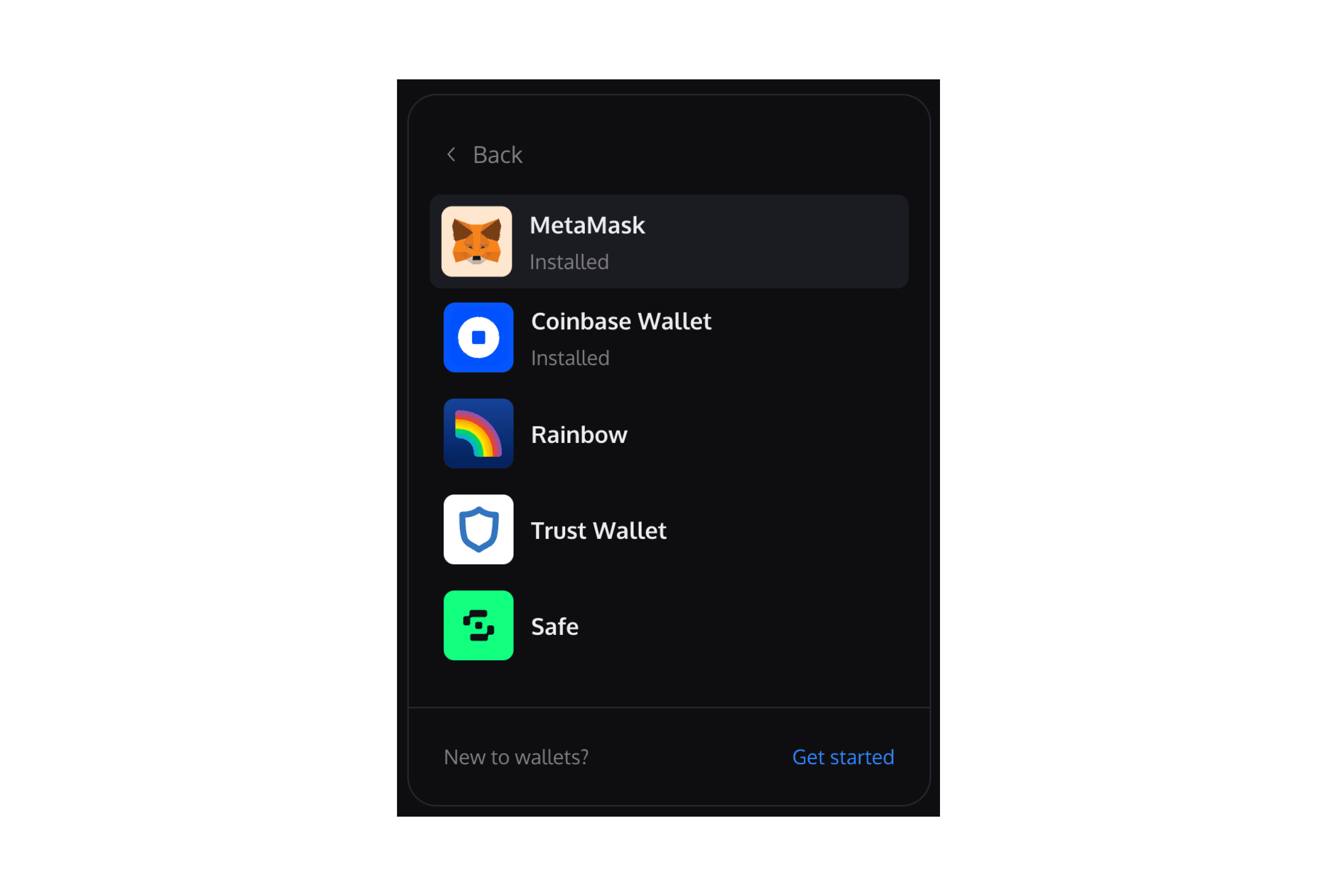
CheckoutWithEth Embed Demo

React Integration

  • Install the React SDK with your preferred package manager.
    • npm install @paperxyz/react-client-sdk-checkout-with-eth
    • yarn add @paperxyz/react-client-sdk-checkout-with-eth
  • Copy your API key from the Developer Dashboard: Developers page.
  • When a buyer wants to make a purchase, create a configs object (see props table below). You will provide some buyer information and configure behavior via this API.
  • Instantiate a PaperSDKProvider provider to store Paper-specific properties.
  • Within the provider, instantiate the CheckoutWithEth component to render this component. Pass the SDK Client Secret to this component.

Example

import { CheckoutWithEth } from "@paperxyz/react-client-sdk-checkout-with-eth";
<CheckoutWithEth
configs={{
contractId: "CONTRACT_ID",
walletAddress: "0x...",
}}
onPaymentSuccess={(result) => {
console.log("Payment successful.");
}}
/>;

CheckoutWithEth props

NameTypeDescription
configs *stringA list of configs to create your eth checkout element. Fields are the same as the ones found in the Create Checkout Elements Client Secret API.
onPaymentSuccess *(props : { onChainTxReceipt: TransactionReceipt; transactionId: string; }) => voidThis method is called after the payment has succeeded onchain.
onPriceUpdate({ cryptoToFiatConversionRate: number; quantity: number; unitPrice: PriceDetail; networkFees: PriceDetail; serviceFees: PriceDetail; total: PriceDetail; }) => voidThis method is called when the price is updated or loaded for the first time. This summary is helpful to show a granular price breakdown. * The valueInSubunits type here differs from the subunits for CheckoutWithCard (which is a number)
localeenum (Valid values: en, fr, es, it, de, ja, ko, zh)The language to show text in. Defaults to en.
receivingWalletTypeenum (Valid values: WalletConnect, MetaMask, Coinbase Wallet, Phantom, Preset)Defaults to Preset. The wallet type of the user wallet receiving the NFT to render the appropriate wallet icon in the component.
suppressErrorToastbooleanDefaults to false. If false, there will be a toast (within the iFrame) that pops up informing the user of what went wrong. This can include canceling transactions, pending transactions, etc.
showConnectWalletOptionsbooleanDefaults to true. If true, a connect wallet screen will be displayed allowing users to connect their wallet.
payingWalletSignerethers.SignerIf provided, the component will request funds from this signer.
onWalletConnected(props: { userAddress: string, chainId: number }) => voidThis method is called when a payment wallet is connected.
onPageChange(currentPage: CheckoutWithEthPage) => voidThis method is called when the buyer transitions between pages.
onError(error: PaperSDKError) => voidThis method is called when an error is encountered.
setUpUserPayingWalletSigner(args: { chainId: number }) => voidThis method is called before the payingWalletSigner is asked to pay with the chainId that the payingWalletSigner is supposed to be on.

Javascript Integration

  • Install the Javascript SDK with your preferred package manager.
    • npm install @paperxyz/js-client-sdk
    • yarn add @paperxyz/js-client-sdk
  • Copy your API key from the Developer Dashboard: Developers page.
  • When a buyer wants to make a purchase, create a configs object (see props table below). You will provide some buyer information and configure behavior via this API.
  • Call createCheckoutWithEthElement to insert the iframe on your page. Pass the SDK Client Secret to this component.
    • If you don't provide elementOrId, this call returns an iframe element for you to insert into your page.

Code example

import type { createCheckoutWithEthElement } from "@paperxyz/js-client-sdk-checkout-with-eth";
// Assume a container exists:
//
// <div id="paper-checkout-container" w="380px" />
//
const iframe = await createCheckoutWithEthElement({
configs: {
contractId: 'CONTRACT_ID',
walletAddress: "0x...",
}
elementOrId: "paper-checkout-container",
payingWalletSigner,
setUpUserPayingWalletSigner,
receivingWalletType,
onError(error) {
console.log("Payment error:", error);
},
onSuccess({ transactionId }) {
console.log("Payment successful.");
},
});
// Alternatively, insert the iframe programmatically:
//
// const iframe = createCheckoutWithEthElement(...)
// document.getElementById('paper-checkout-container').appendChild(iframe);

Props

NameTypeDescription
configs *stringA list of configs to create your eth checkout element. Fields are the same as the ones found in the Create Checkout Elements Client Secret API.
payingWalletSigner *ethers.SignerThe connected wallet who is going to be paying the ETH required for the checkout
localeenum (Valid values: en, fr, es, it, de, ja, ko, zh)The language to show text in. Defaults to en.
optionsobjectCustomize component styling. See Customization.
setUpUserPayingWalletSigner(args: { chainId: number; }) => void | Promise<void>If provided, the callback will be called before asking buyers to pay with the chainId that they are expected to be on. Developers must make sure that users are on the right chain (Goerli for testnets, Eth for mainnets) or risk buyers sending funds into the void.
receivingWalletTypeenum (Valid values: WalletConnect, MetaMask, Coinbase Wallet, Phantom, Preset)Defaults to Preset. The wallet type of the user wallet receiving the NFT to render the appropriate wallet icon in the component.
onError(error: PaperSDKError) => voidThis method is called when anything wrong happens during the checkout process.
onPaymentSuccess(props: { onChainTxReceipt: TransactionReceipt; transactionId: string; }) => voidThis method is called after the payment has succeeded onchain.
suppressErrorToastbooleanDefaults to true. If false, any error thrown will be displayed in a toast.
onLoad() => voidThis method is called when the iframe loads.
elementOrIdstring | HTMLElementIf provided, the iframe will be appended this element. You can pass in the DOM element or the id associated with the element. A minimum width of 380px is recommended.

Customization

The optional options argument allows you to customize the component's styling. All customization fields are optional.

options object

NameTypeDescription
colorPrimarystring (In hex, e.g. #cf3781)The primary brand color for buttons and links.
colorBackgroundstring (In hex, e.g. #cf3781)The background color of the page.
colorTextstring (In hex, e.g. #cf3781)The color for text on the page and UI elements.
borderRadiusnumber (In px, e.g. 0 for sharp corners, 12 for rounded corners, 24 for pill shape)The roundness of buttons and input elements.