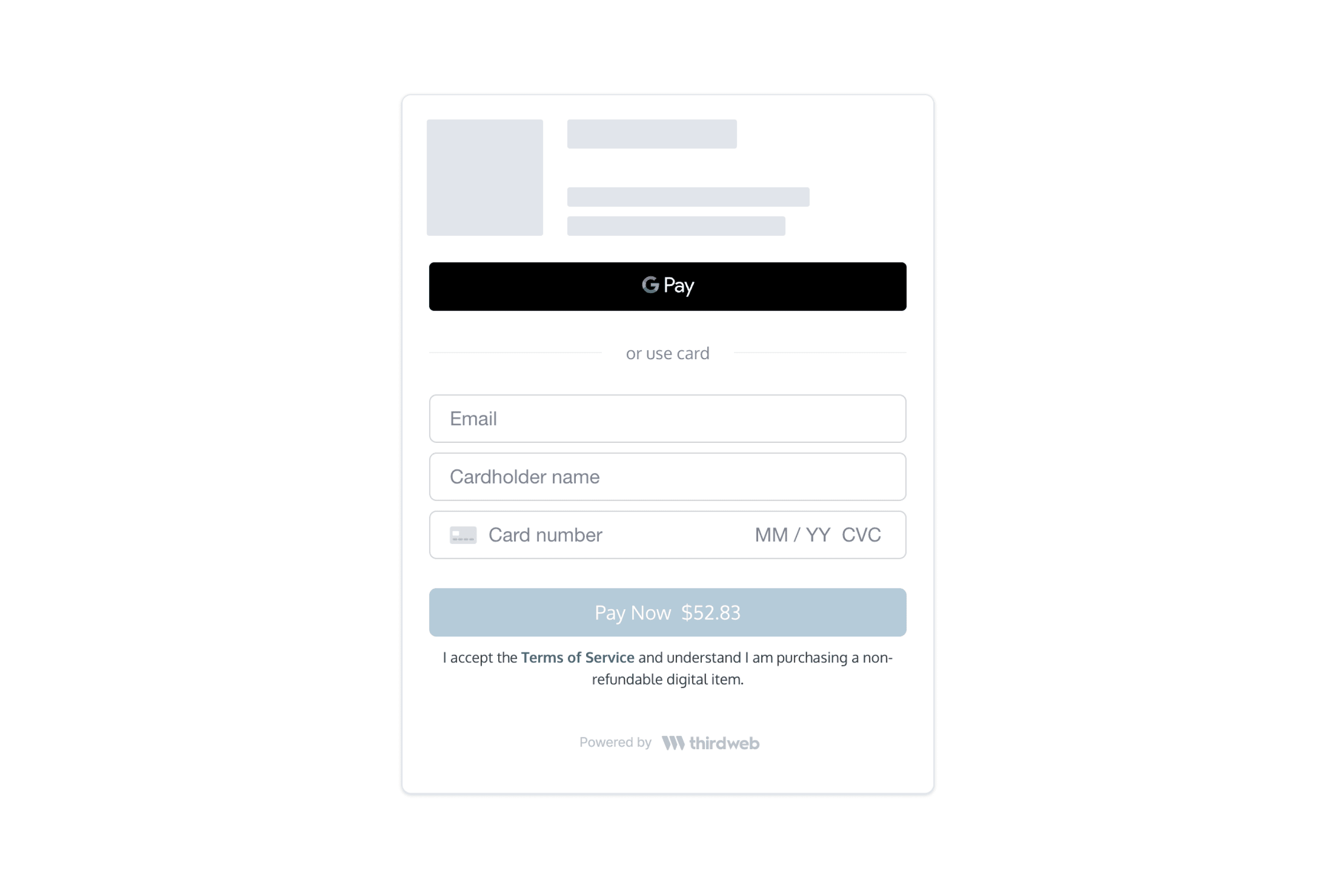
Docs

CheckoutWithCard

The CheckoutWithCard element embeds a form on your app that accepts credit/debit card, Apple Pay, and Google Pay.

This component also handles:

  • Apple Pay and Google Pay
  • Bot and anti-fraud detection
  • 3D Secure (if necessary)
  • Buyer KYC (if necessary)
CheckoutWithCard Embed Demo

React Integration

  • Install the React SDK

    Follow our SDK install guide here.

    npm install @thirdweb-dev/react
    yarn add @thirdweb-dev/react
  • Embed your component

    On your frontend, render the CheckoutWithCard component with your configs.

Example

import { CheckoutWithCard } from "@thirdweb-dev/react";
<CheckoutWithCard
clientId="YOUR_CLIENT_ID"
configs={{
// Registered contract ID
contractId: "YOUR_CONTRACT_ID",
// Buyer wallet address
walletAddress: "0x...",
// Mint method (for custom contracts only)
mintMethod: {
name: "claimTo",
args: {
_to: "$WALLET",
_quantity: "$QUANTITY",
_tokenId: 0,
},
payment: {
value: "0.1 * $QUANTITY",
currency: "ETH",
},
},
}}
onPaymentSuccess={(result) => {
console.log("Payment successful:", result);
}}
/>;

CheckoutWithCard props

NameTypeDescription
clientId *stringthirdweb client ID (Obtained from an API key which you can generate on the Dashboard)
configs *objectA list of configs to create your card checkout element. Fields are the same as the ones found in the Create Checkout Elements Client Secret API.
onPaymentSuccess *({ transactionId: string; }) => voidThis method is called after the payment has been submitted for processing. This payment may still be rejected by the cardholder's bank.
onError(PaperSDKError) => voidThis method is called when an error is encountered.
onPriceUpdate({ quantity: number; unitPrice: PriceDetail; networkFees: PriceDetail; serviceFees: PriceDetail; total: PriceDetail; }) => voidThis method is called when the price is updated or loaded for the first time. This summary is helpful to show a granular price breakdown. Where PriceDetail is { display: string; valueInSubunits: number; currency: string; }
localeenum Valid values: en, fr, es, it, de, ja, ko, zhThe language to show text in. Defaults to en.
optionsobjectCustomize component styling. See Customization.

Javascript Integration

  • Install the Javascript SDK with your preferred package manager

    Follow our SDK install guide here.

    npm install @thirdweb-dev/payments
    yarn add @thirdweb-dev/payments
  • Add your iframe

    Call createCheckoutWithCardElement to insert the iframe on your page. Pass the configs to this component.

    If you don't provide elementOrId, this call returns an iframe element for you to insert into your page.

Example code

import { createCheckoutWithCardElement } from "@thirdweb-dev/payments";
// Assume a container exists:
//
// <div id="paper-checkout-container" width="380px" />
//
createCheckoutWithCardElement({
clientId: "YOUR_CLIENT_ID",
configs: {
contractId: "YOUR_CONTRACT_ID",
walletAddress: "0x...",
}
elementOrId: "paper-checkout-container",
appName: "My Web3 App",
options,
onError(error) {
console.error("Payment error:", error);
},
onPaymentSuccess({ id }) {
console.log("Payment successful.");
},
});
// Alternatively, insert the iframe programmatically:
//
// const iframe = createCheckoutWithCardElement(...)
// document.getElementById('paper-checkout-container').appendChild(iframe);

Customization

The optional options argument allows you to customize the component's styling. All customization fields are optional.

options object

NameTypeDescription
colorPrimarystring (In hex, e.g. #cf3781)The primary brand color for buttons and links.
colorBackgroundstring (In hex, e.g. #cf3781)The background color of the page.
colorTextstring (In hex, e.g. #cf3781)The color for text on the page and UI elements.
borderRadiusnumber (In px, e.g. 0 for sharp corners, 12 for rounded corners, 24 for pill shape)The roundness of buttons and input elements.
inputBorderColorstring (In hex, e.g. #cf3781)The border color of the input field.
inputBackgroundColorstring (In hex, e.g. #cf3781)The background color of the input field.

Example

Here's an example component with the following props:

{
colorBackground: '#fefae0',
colorPrimary: '#606c38',
colorText: '#283618',
borderRadius: 6,
inputBackgroundColor: '#faedcd',
inputBorderColor: '#d4a373',
}
CheckoutWithCard Embed Demo